Category: Email Marketing Trends

Simplifying is confirmed as this year's trend and minimalist design is one way to apply it to your email marketing. This concept is perfectly summed up in the motto "less is more": less text, fewer colours, less typography... less hassle to read, and easier to understand.
A simple way to get started in minimalism is to start from your latest email campaigns or your current template and remove redundancies, i.e. simplify the email design as much as possible. But you need to know which elements to remove so that it still makes sense and fulfils its purpose within your marketing strategy.
Let's take a look at the five keys to minimalist email design to make communication clearer and more direct with a couple of examples to inspire you.
Small text is hard to read, even more so on mobile devices. On the other hand, using slightly larger font sizes than usual ensures good readability and attracts attention. It's not about making huge headlines if you don't dare to change your style too much, but take advantage of the fact that there are only a few words to make them stand out.
Source: Email Love
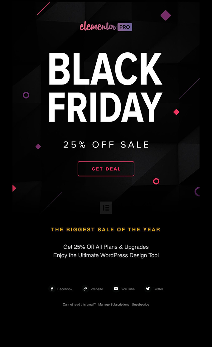
In the following example, it is very likely that you will scroll as requested because the headline arouses curiosity by taking up a large part of what the user will see in the inbox preview.
Source: Email Love
It's common to overthink an idea to try to explain it in detail so that it's easier to understand. In this case, it is necessary to write in small blocks of text and to add some emojis or icons to lighten the number of words. But it is not always necessary, it may be enough to add a minimal explanation to the headline. And that's it.
Source: Email Love
This possibility is more evident in campaigns where there is little to tell, such as Black Friday, because all customers already know what to expect: you just have to make the offer clear.
Source: Email Love
Although it is always advisable not to use more than two fonts in email campaigns, in minimalist designs it can even be reduced to one, for example by playing with the size and not so much with the typography.
Source: Email Love
In general, the more visual changes there are, the more complicated it gets, but it can be simplified by keeping the hierarchy between fonts very clear.
Source: Email Love
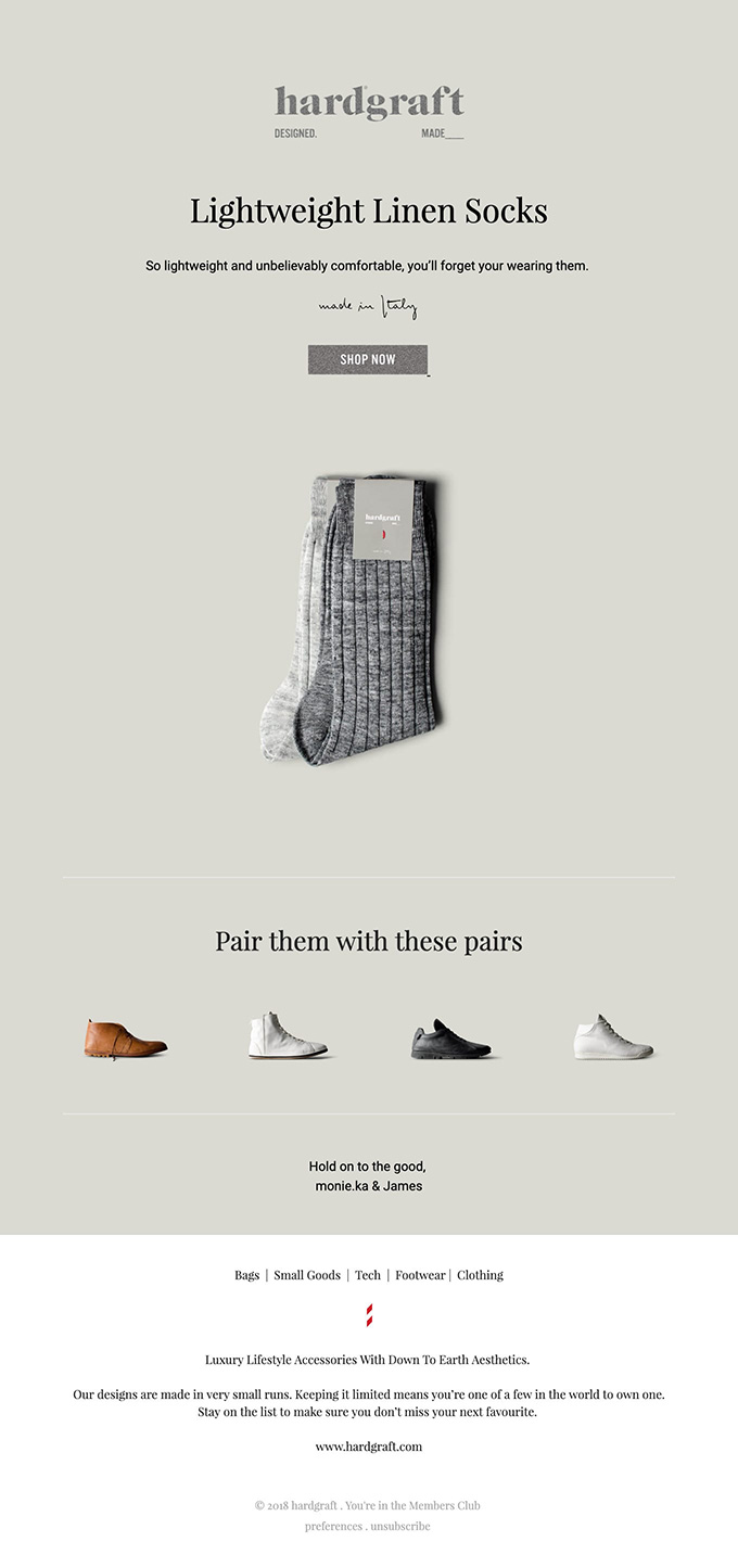
There is nothing simpler than black letters on a white background and buttons with black borders. Images can also be monochromatic or given a single splash of colour to highlight an element you want potential customers to notice.
Source: Email Love
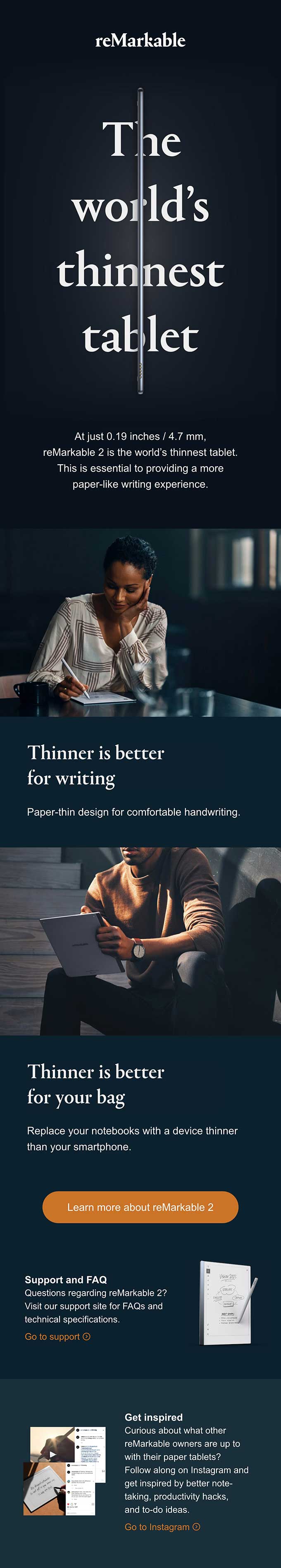
The opposite effect can also work well, especially for brands that want to convey elegance. In this case, note that they have used orange only for the calls to action to ensure contrast.
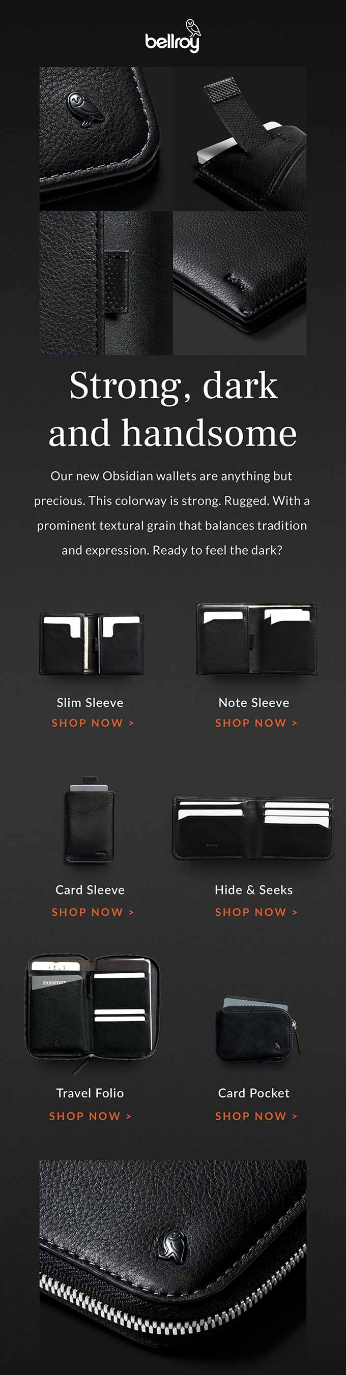
Source: Email Love
Design trends are changing, but the idea of letting content breathe surrounded by white space is becoming an almost mandatory element. In email marketing, it is especially key to make the call to action stand out, but it can also be applied to headlines surrounding an image.
Source: Email Love
In the last example, again white becomes black, but notice how much space they give to everything: from the header to the margins and the separation between images. They show that white space can also change colour and still be minimalist.
Source: Email Love
Do not miss anything from our blog and join our Telegram https://t.me/acrelianews
Haven't you tried Acrelia News yet?
If you like this post, you will like much more our email marketing tool: professional, easy to use.

Sign up to our newsletter
Last email marketing trends and news


 Tips and tricksE-BooksTrends and newsCase studiesInfographics

© Copyright 2024 Acrelia News | Terms of use | Cookies Policy | Legal notice | Privacy Policy