Category: Email Marketing

Going off the beaten path is one way to get attention in your email marketing campaigns. Some brands do it all the time and from all angles because it's their style; others do it from time to time and only with certain elements. We encourage you to experiment with a few bold changes like the ones in the following examples to test how much your subscribers' response varies.
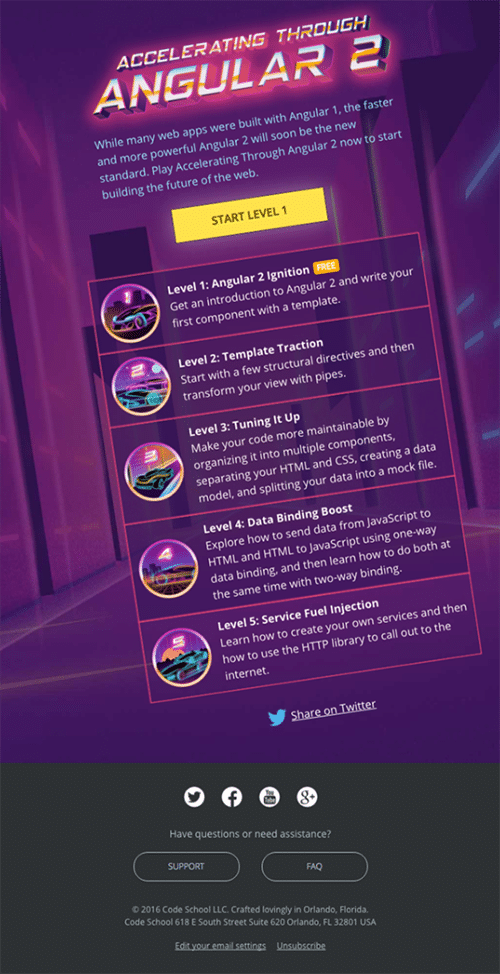
Surely, when you read "make changes", the first thing you thought of was the template. Yes, it is the most obvious way, but there are others that can be disruptive and eye-catching. Can you imagine if the central image of the campaign was not straight but slightly inclined? It would be a very direct way for the subscriber to recognise that message as yours.
Source: Really Good Emails
Changing the header is also something we have recommended on more than one occasion. Seasonal or calendar-related headers work very well, but you can also do it for a specific reason. It will depend on your personality, but it can be a wink that your subscribers will appreciate and that will make you more approachable.
Source: Really Good Emails
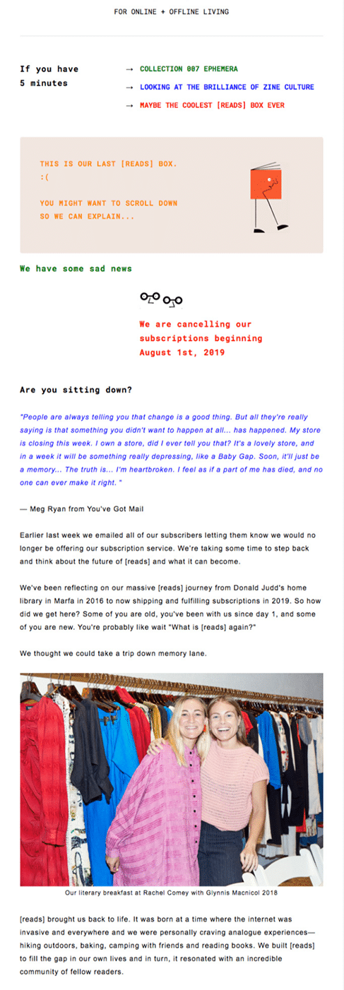
Campaign titles are usually descriptive, informative, and functional. It's not the place where someone would expect to find an overly casual phrase. To be bold with communications is also to give them a new tone to make them more conversational. Start with the subject line, fix it in the headline and extend it throughout the mailing.
Source: Really Good Emails
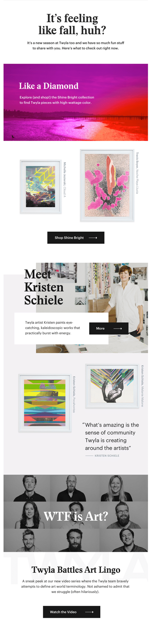
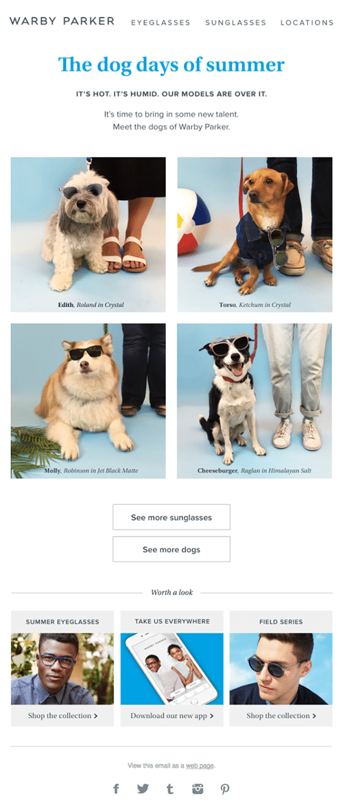
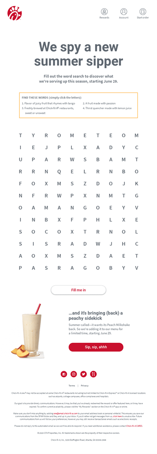
Product photo shoots are a good opportunity to look for bold images. At the very least, have them when you're ready to break out of the same ones you've probably used dozens of times before. The alternative is to make a funny montage or ask artificial intelligence to do it.
Source: Really Good Emails
The choice of font is complicated, a branding decision that affects how your newsletter is read. What if one day you change it for a different one that better reflects what you are explaining? What if you base the whole message on text, with hardly any images? By playing with the size, colours and alignment you can also create a campaign that makes an impact because it is different.
Source: Really Good Emails
Just like typography, the colour palette is usually set before you even start email marketing. Even so, a daring email would be the one that, as soon as you open it, surprises you with the combination and contrast of the figures with the background. Try it... without being a conflict for accessibility.
Source: Really Good Emails
The same thing happens with CTAs as with images: the same ones are always used. "Buy now", "Read more" or "Sign up". Changing registration is a gamble that has a direct impact on clicks, so it generates doubts. You can test it in a mailing to recurring customers who will be more convinced to click than others who are not yet sure what to expect from your brand.
Source: Really Good Emails
If you want to get bold, every detail counts. Even the footer. It is true that few people read it, but you have to be coherent and, if you do all of the above, you can also add a little personality to the privacy policy or the unsubscribe button (always respecting the RGPD, of course).
Source: Really Good Emails
We have left for the end two examples that could be in any of the previous points because they break with everything you expect from a corporate email. The first has to do with a job offer and the visual demonstration that someone is needed for the position. It may seem risky, but it certainly attracts attention, which at the end of the day is what you are looking for with this type of communication.
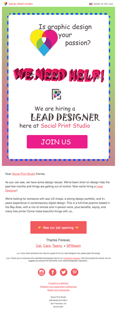
Source: Really Good Emails
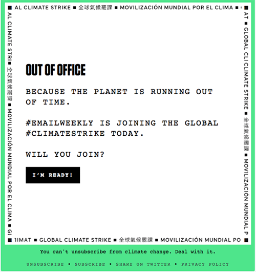
The second and last example on the list has to do with daring to go against the grain in the whole campaign, not only in the design, colours or text. We are referring to the whole creative concept, of using such a popular time for shopping as Black Friday and turning it upside down by asking for money without giving anything in return.
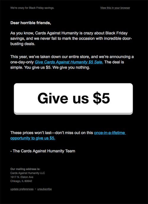
Source: Really Good Emails
Do not miss anything from our blog and join our Telegram https://t.me/acrelianews
Haven't you tried Acrelia News yet?
If you like this post, you will like much more our email marketing tool: professional, easy to use.

Sign up to our newsletter
Last email marketing trends and news


 Tips and tricksE-BooksTrends and newsCase studiesInfographics

© Copyright 2024 Acrelia News | Terms of use | Cookies Policy | Legal notice | Privacy Policy