Category: Email Marketing

The sign-up form is a determining factor in the quality and quantity of the subscribers' list: it can convince or alienate them to sign up and give us their data, depending on how it is designed. Capturing or losing leads will also depend on the arguments used and where the form is displayed.
Following some good practices like the ones we propose in this post will help you to detect what you can improve.
It seems basic, but it is easy to forget: the form must be defined according to the objectives of email marketing. For example, if we want to get sign-ups, we can use lead magnet content, while if we want to increase sales, we can send a discount coupon to all those who sign up.
The user is the one who will be in front of the form and will decide whether to fill it in or not. Think about what kind of subscribers you want to get and write a text to convince them of the benefits they will get, especially if you ask them to do it to get something in return. Also, explain what kind of campaigns they will receive and their frequency. If you have them, add a testimonial or a sentence from subscribers to show them that they won't make a mistake by signing up.
The call to action button should also be written with the customer in mind. You have to convince them to click, how can you do it in a couple of words? Avoid the typical ones ("send") and the ones that can slow him down ("download"), and better use his point of view ("I want to learn"). In this way, registration is one more step in a process that can end with the action of future mailings.
Don't over-explain or ask for more information than what you need. When it comes to an informative newsletter, don't overdo it. Simplify the text to get straight to the point, you will ask them to complete the information later.
You can choose which technique you want to use to make it easy to find: a pop-up to recommend downloading the lead magnet, a fixed bar at the top to get a discount on the next purchase or a widget in the sidebar of the blog to receive the next posts. You can shape it however each channel requires, even put it in a Facebook tab.
The more complex the form, the more difficult it will be to complete from any device. And, the more shapes you design, the more you have to be careful not to annoy users too much, especially those who view them on their mobiles.
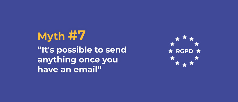
You have to comply with the GDPR, so your form must have a checkbox to collect user consent and must show users what you will do with their data. Using the double opt-in confirmation may seem to complicate registration, but this way you ensure their interest and the quality of the list.
As with any other landing page, testing is the best way to optimise the conversion results of a registration form. In addition to testing different texts to detect the most persuasive in the call to action, look at the design, for example, the contrast of colours, and the number of fields it has.
Do not miss anything from our blog and join our Telegram https://t.me/acrelianews
Haven't you tried Acrelia News yet?
If you like this post, you will like much more our email marketing tool: professional, easy to use.

Sign up to our newsletter
Last email marketing trends and news


 Tips and tricksE-BooksTrends and newsCase studiesInfographics

© Copyright 2024 Acrelia News | Terms of use | Cookies Policy | Legal notice | Privacy Policy