Category: Email Marketing Trends

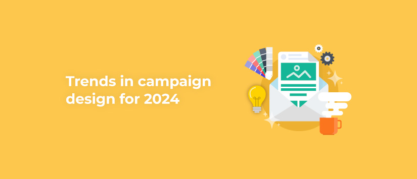
In addition to this year's email marketing trends, there are also those that are specific to campaign design. We'll tell you about some of the trends we've spotted, but first a word of advice: always keep them in mind from the perspective of your own style and identity. They may inspire you to give a new look to your next mailings, but never lose sight of who you are in order to maintain coherence.
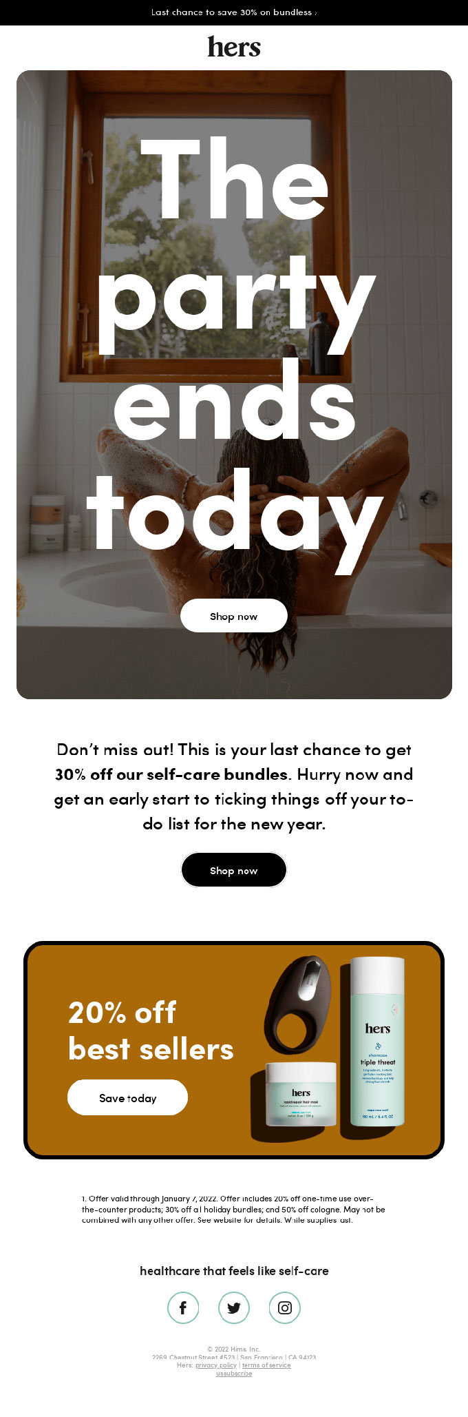
When it comes to colours, dark green is in: no dazzling neon or fluorescent colours. On the contrary, use a shade that can be used in contrast with white, orange or lighter greens to give your template a calmer feel. In addition, green is associated with green companies or anyone concerned about the environment, so it is also a good colour to go for.
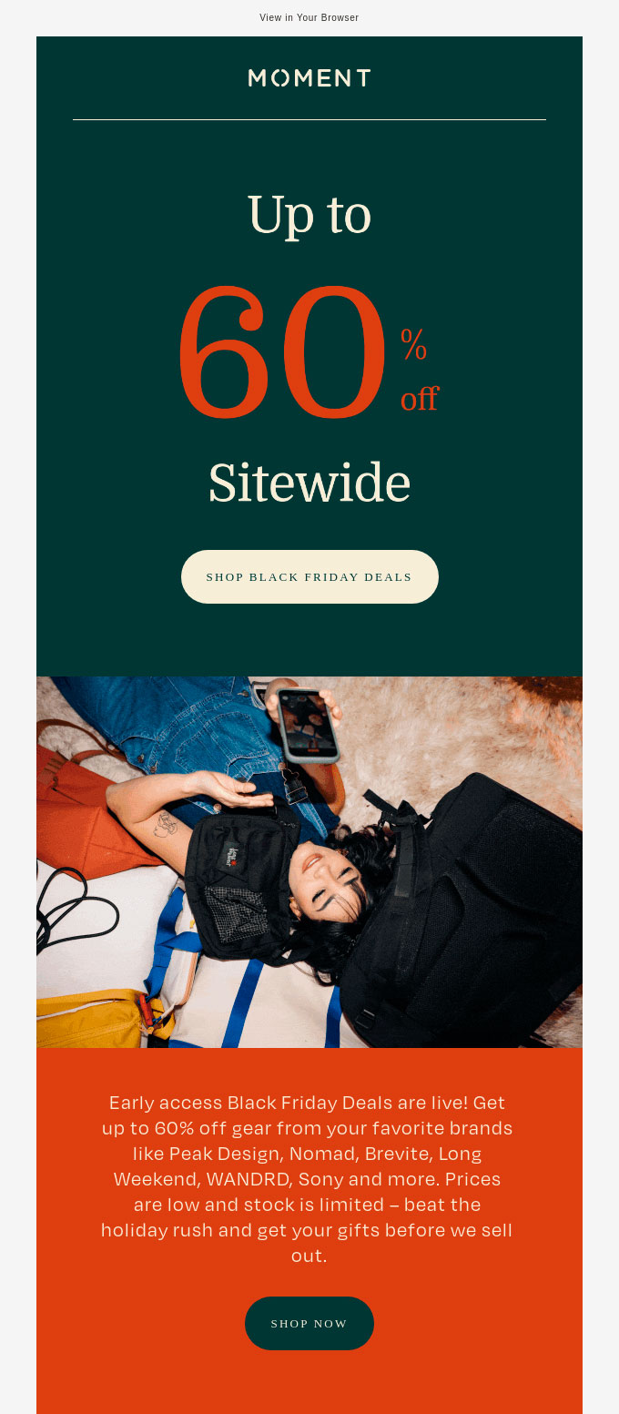
Source: Email Love
In typography, make the letters bigger: titles no longer need to be all on one line, even short sentences can be chopped up so that each word takes up almost the entire width of the email. This draws attention both to the text and to the image that accompanies it, which can be very vertical because people will scroll down to read the message.
Source: Email Love
In headers, rounding off: when it comes to opening a newsletter or a notification, it is important to make everything easy to read at a glance. That's why images and buttons have been gradually rounded at the edges, so that everything flows without interruption. Even if there are no sharp edges, it is not necessary to turn all pictures into circles: it is enough to add a few degrees to the rounding.
Source: Email Love
When it comes to tables, the borders should be well marked: tables are no longer a gimmick to line up design elements, they are now a gimmick in their own right. Simply add a coloured border to make them stand out, for example to separate sections or to frame products or photos. With this style, buttons should also have rectangular borders and in general everything will have a more Cartesian look that can suit some brands very well.
Source: Email Love
In images, deep shadows to give volume: this is a trick that is well known to designers, but it still works for this new year as well. By adding shading, you can give a bit of life to the product to make it look more real, or make boxes and buttons visually stand out to encourage clicking. Remember that the ideal when there are several elements is that they all have the same type of shadow.
Source: Email Love
In composition, say yes to layering: start highlighting the uncomplicated blending of text on image. As long as there is a good contrast of colours, it is not a problem, although it is true that until now it was preferred to separate both elements well. The trend is to focus more on the overall composition, even if it causes some overlapping (and is not perceived as a mistake, of course).
Source: Email Love
As you can see, every year new ways of designing email marketing campaigns, that break some concepts that were previously unchangeable, are being added. All in order to continue to attract the attention of subscribers by breaking their visual patterns, even if it is just a little bit in each mailing.
Taking into account the design trends that we have just shown you, we have created this email template available on our platform so that you can use it in your future mailings.
Do not miss anything from our blog and join our Telegram https://t.me/acrelianews
Haven't you tried Acrelia News yet?
If you like this post, you will like much more our email marketing tool: professional, easy to use.

Sign up to our newsletter
Last email marketing trends and news


 Tips and tricksE-BooksTrends and newsCase studiesInfographics

© Copyright 2024 Acrelia News | Terms of use | Cookies Policy | Legal notice | Privacy Policy