Category: Email Marketing Trends
![]()
The statistics of any email marketing platform will tell you where users click, but the only way to know what they have looked at before is with an eye-tracking study. What matters the most is the action, but what happens in the previous seconds allows you to understand the behaviour of your subscribers to introduce improvements that will lead you to get more clicks, whether in the text, in the images or the design in general.
Among the studies that analyse user experience, we find usability. This discipline, applied to the digital environment, ensures that websites and apps are easy to use so that the user can effortlessly achieve their objective (find information, buy, etc.). One of the many techniques to test their behaviour in front of the screen is eye movement tracking.
To carry out such a study, the user must wear glasses designed to capture where he or she looks and what reading pattern he or she follows. Thanks to this, it is possible to find out what catches their attention as soon as they land on the webpage, what they carefully read, or where they simply glance.
The aggregate amount of these movements result in a heat map that visually indicates the points that have attracted the most attention on a scale from red to green (the least interesting). In addition, it is possible to study a different heat map for each device, for example on different screen sizes i.e: computer, tablet or mobile, to optimise design and conversions.
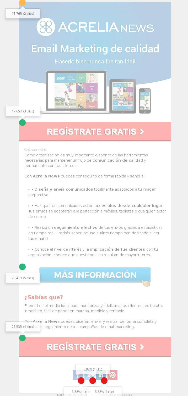
Eye tracking studies can be complemented by tracking the mouse on the screen to know its behaviour, where the mouse stops and what specific part of an image is clicked.
How users read an email influences the results it achieves. By knowing where they stop and which elements they look at, it is possible to design campaigns to guide their gaze to the key points of interest, such as buttons and calls to action.
The most common reading pattern in articles (also applicable to some campaigns) is the F-shape: a vertical glance and horizontal headlines.
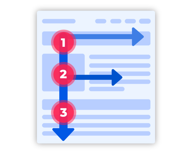
But user behaviour changes depending on what they are reading. For example, Google's results page offers more and more information on the right, resulting in a pattern known as pinball because the eye moves from one side to the other.
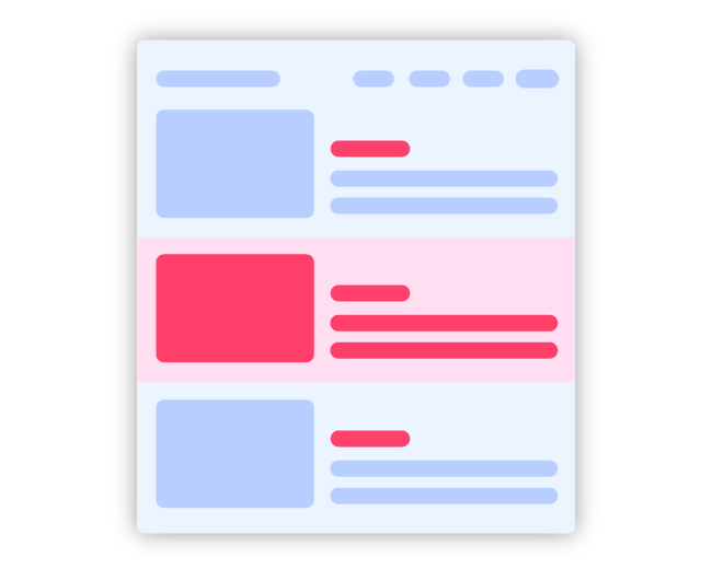
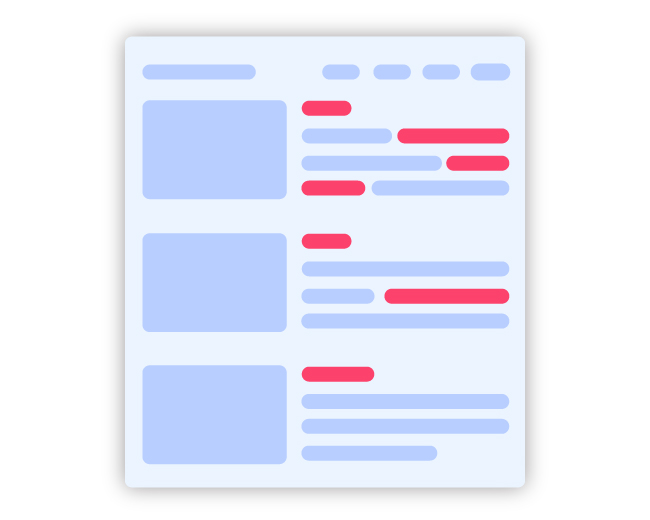
In an informative newsletter with images on the left and descriptive text on the right, the pattern changes. Here are some possibilities:
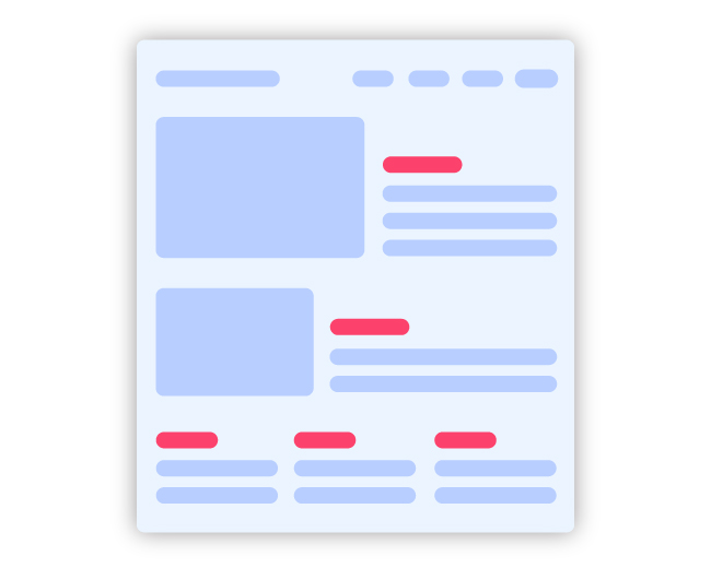
Realistically, it is very difficult to read all the content. Usually, only a part of the content is read and the eye stops at a number, button or link, creating marks on the screen.
When designing an email marketing campaign, you have to take into account the way it is read, both on the computer screen and on mobile devices. Choosing responsive templates, like all the ones you will find in Acrelia, is the first step. The next is to apply the conclusions of eye tracking studies to email marketing so that you and the user can achieve your objectives.
Some recommendations:
Eye tracking studies have shown that the size of the screen on which an email is read influences reading patterns. We recommend that you check your statistics to find out from which screens your campaigns are opened the most and make sure that you optimise the design visually to how most of your users will read it.
Do not miss anything from our blog and join our Telegram https://t.me/acrelianews
Haven't you tried Acrelia News yet?
If you like this post, you will like much more our email marketing tool: professional, easy to use.

Sign up to our newsletter
Last email marketing trends and news


 Tips and tricksE-BooksTrends and newsCase studiesInfographics

© Copyright 2024 Acrelia News | Terms of use | Cookies Policy | Legal notice | Privacy Policy