Category: Email Marketing

In 2018 Apple introduced the "Dark mode" in his desktop email reader. Not long after Apple did that, they also incorporated it into iOs mail. They were followed by industry giants such as Gmail and Outlook.com who they also included the "Dark mode" on their services.
Nowadays the "Dark mode" is an option used by many users and because of this it is important to make sure our emails look good in this new reading environment.
CONTENT
The "Dark mode" or "Night mode" is a colour scheme that is applied to email readers and consists of using light colours for icons, user interface elements and fonts, on dark background colours. It is an accessibility option available on email readers, as well as in operating systems and apps.
Dark mode, or dark mode, is a growing trend for many reasons:
Users can choose to use "Dark mode" on the following email readers:
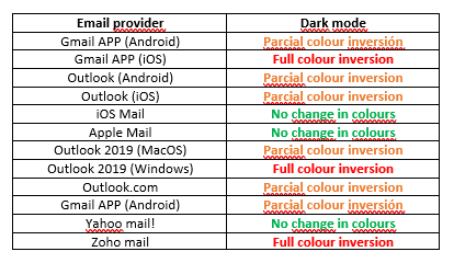
Not all the email readers apply the "Dark mode" in the same way: some of them only change the user interface, but do not change the colours of our email. Some of them partially invert the colours and some of them change it completely.
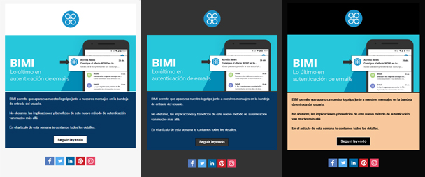
Some readers such as Gmail, Yahoo mail and Apple mail only change the colours of their interface when dark mode is applied. This means that the dark mode does not affect how our email is rendered and will be displayed exactly as it is.
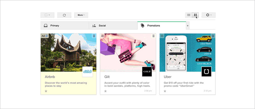
Here is an example with Gmail: The design of your email is the same no matter which mode is used:
In some readers, the dark mode option only detects the areas of your email that use light background colours and inverts the background colour to dark and the texts to light colours. Areas that already use dark background colours are not changed. The rest of the elements, either.
This is the case for example of Outlook.com. If you look closely, you will see that the border of the black button has been maintained and no changes have been made to the dark backgrounds:
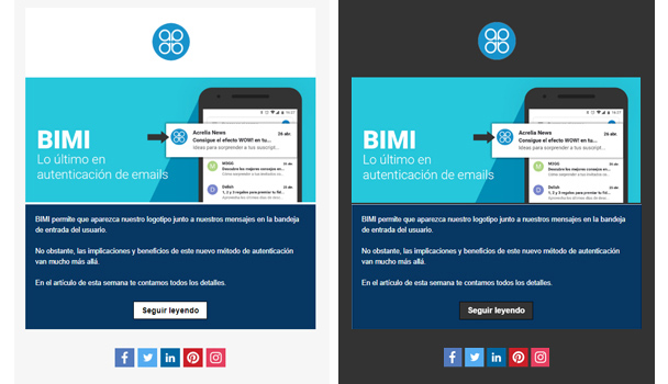
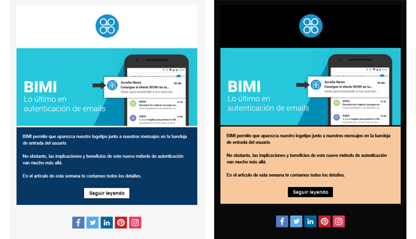
Other mail readers, such as Gmail for iOS or Zoho mail, invert all colours. Meaning that they not only change light backgrounds to dark, but dark backgrounds to light. This colour scheme is the one that applies the most radical changes to the design of our email.
Below is a table of how each email reader behaves when applying dark mode. This table may change over time, as many readers, such as Gmail, use user feedback to make improvements to their dark mode theme.
Not all readers use the same colour scheme when the user is working with the dark mode. That is, the colours used by each reader to replace the original colours differ from each other. To avoid this from happening, we can specify in the html how we want our emails to be rendered in dark mode, but not all readers allow this (for example, Gmail does not support it).
If we know how to work with html code, we can use these two methods to tell the reader how to display our email:
@media (prefers-color-scheme: dark)
[data-ogsc] and/or [data-ogsb], for Outlook app (Android)
However, there are a number of techniques that we can apply to our emails so that they display correctly in dark mode without needing to modify the html.
Test your campaign to make sure that your design and the readability of the content is not affected in case the user has the dark mode active. As we have mentioned, each reader applies its own colour scheme, so it is advisable to test your email in the most popular readers to see the result in each of them.
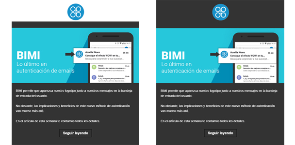
If you use images with a transparent background, when the colours are inverted with the dark mode, the design of your newsletter will look more uniform and will not have such a visible effect.
In the following image you can see the difference between using the logo with and without background:
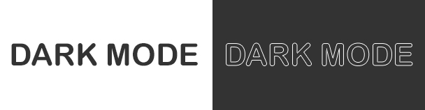
If you use black icons or text in the image, they will not be visible in dark mode. To avoid this, add a white outline. In light mode they will not be visible and in dark mode they will be displayed correctly.
Email readers are constantly changing, especially when it comes to dark mode, applying improvements and modifications to their colour schemes to improve the user experience for those who use this mode to view their emails. For this reason, it is really important to test our emails to ensure that they will render correctly in this mode in the most popular readers.
Do not miss anything from our blog and join our Telegram https://t.me/acrelianews
Haven't you tried Acrelia News yet?
If you like this post, you will like much more our email marketing tool: professional, easy to use.

Sign up to our newsletter
Last email marketing trends and news


 Tips and tricksE-BooksTrends and newsCase studiesInfographics

© Copyright 2024 Acrelia News | Terms of use | Cookies Policy | Legal notice | Privacy Policy