Category: Email Marketing
The font is part of your corporate identity, just like the colour. Surely you will have a set font for your logo and you use it for presentations or whenever you can to be consistent with your brand. It was chosen because it communicated a message related to the values you wanted to position, but perhaps it is not intended for its use in digital marketing.
In an email campaign, you can use different fonts depending on the purpose of the text. Combining a serif (the best known is Times New Roman) and a sans serif (the equally famous Arial) is much more visually appealing and makes each block stand out. This makes the whole newsletter easier to read and grants more clicks.
There are a couple of sections that can have a different font than the one used in the body itself: header, titles and subtitles. But don't use more than two different fonts in the same email or it will lose its effect, it is better to simply play with the sizes to create blocks.
Let's take a look at the fonts that our web design team has found to work well in different sections: they are free to use and available on Google Fonts.
The easiest option is to insert the logo at the top, but you can also design a header image specifically for your email marketing and use fonts that give it a personality of its own. Also, if you create banners to promote some aspect of your business, you should use the same style.
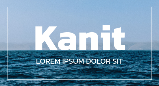
Sans serif font with four styles: thin, light, book and regular.
Perfect for strong names that need to be eye-catching without being extravagant. It also works well for communicating short, clear messages.
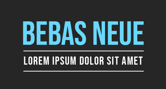
A compact, geometric style font. It has flat angles and is highly legible.
Perfect for contemporary and futuristic uses.
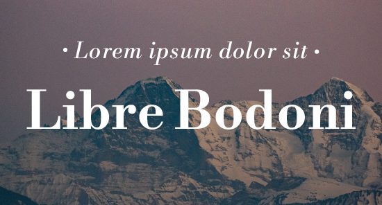
Serif font based on the design of classic 19th-century fonts but adapted to today's web requirements.
Perfect for elegant brands related to style, luxury and fashion.
Display font, variation of the famous Lobster.
Perfect for fun designs, parties, invitations, discounts and promotions.
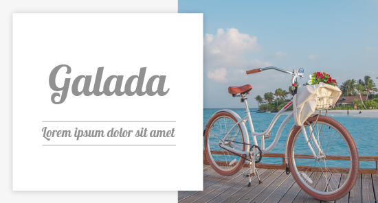
Visually explores the relationship between typography and calligraphy.
Perfect for short texts and slogans due to the elegance of its capital letters.
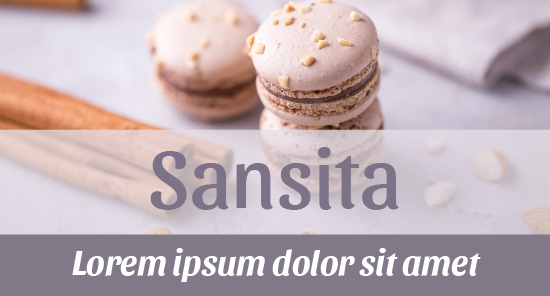
Inspired by fonts from the 1930s. Easy to read due to its linear stroke and sharp curves.
Perfect for applying different thicknesses to create a clean, modern aesthetic.
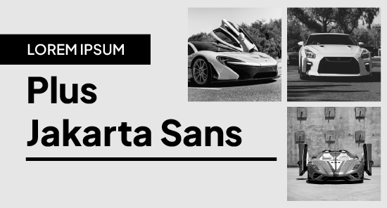
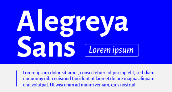
Font designed to be pleasant to read on all types of screens. It features slightly condensed forms and robust finials.
Perfect for creating a classic look by combining bold and regular.
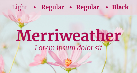
Geometrically executed, a grid-based font created for decorative purposes.
Perfect for conveying modern and disruptive concepts.
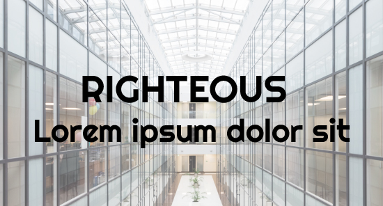
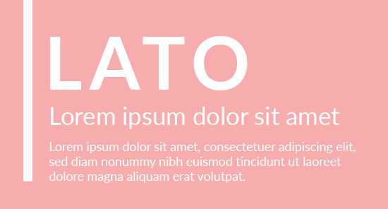
All of the ones we have just seen could be used in titles and subtitles, but they attract more attention in banners. The ones listed below are newsletter fonts that generate more visual contrast and therefore fit well in headers, lead paragraphs or even call-to-action buttons.
Font with shapes that exude elegance and harmony.
Perfect for transmitting stability and seriousness, as well as a sense of warmth thanks to the semi-rounded details of the letters.
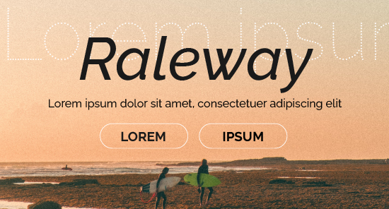
A font with a dotted version (Raleway Dots) that can be used for decorative phrases.
Perfect for short texts, such as highlighting important information, or long texts, such as explanatory paragraphs.
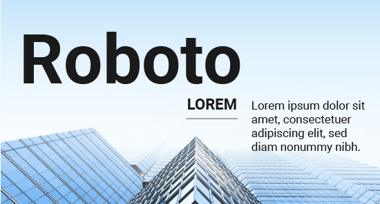
A more modern alternative font to the classic Helvetica. Its Roboto Slab variation has finials, allowing for different combinations between text and paragraph.
It is also perfect for long texts in the body of the newsletter because of its friendly and open curves that allow a good reading pace.
Font with rounded edges, with a clear and soft appearance. It has eight different styles so it is easy to adapt to a wide variety of communications.
Perfect for buttons and promotional text.
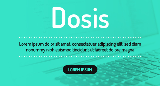
Italic-style font, but vertical rather than slanted. The slight contrast in its strokes with pronounced curves makes it very friendly.
Perfect for all types of texts due to the versatility of its three styles.
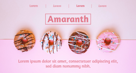
A font with calligraphic roots that achieves a memorable look for standouts.
Perfect to convey sophistication, delicacy and femininity.
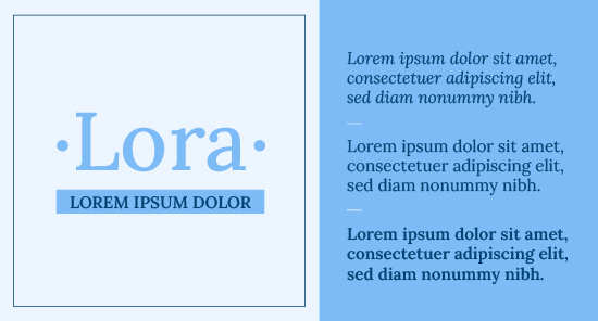
Condensed, square typeface.
Perfect for applying to futuristic techniques or sectors, but with a soft feel thanks to its rounded tips.
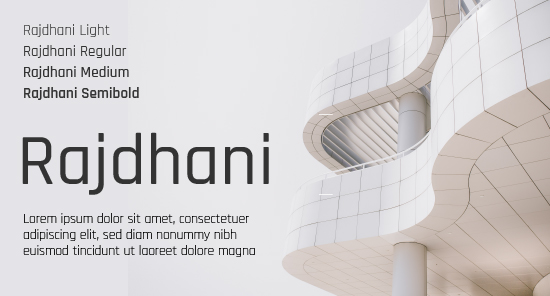
A font that removes density from texts and gives a pleasant reading sensation to subscribers.
Perfect for transmitting dynamism with a playful and fun feel.
Do not miss anything from our blog and join our Telegram https://t.me/acrelianews
Haven't you tried Acrelia News yet?
If you like this post, you will like much more our email marketing tool: professional, easy to use.