Category: Email Marketing

We all have a favourite colour, both individuals and businesses. Colour is one of the elements of a brand's corporate identity, as it helps us visually identify the sender of a message, like the typography or the logo. It also leads us to assign certain values to the brand because each colour carries different cultural connotations. All communications should respect the corporate identity, so it's important to choose it wisely.
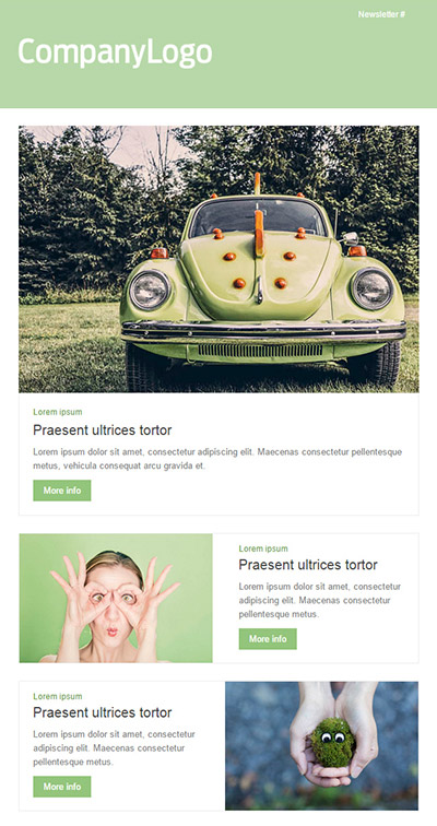
The primary colour of Acrelia News is blue; it's in our logo, and you may have seen it as the background on our website. However, we sometimes use orange as well, for instance in some of our newsletter headlines. This palette of colours is called complementary because there is a clear contrast between them. This way, calls to action and banners stand out more, as they are opposite colours and are easier to identify when speed-reading.

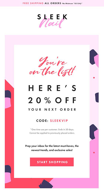
When you want to create a more uniform image, you can use analogous colours, meaning those that are next to each other on the colour wheel. Applied to a newsletter, for example, it might involve combining shades of orange, red, and brown to create an autumn campaign or using a light pink background with violet or magenta buttons. Some elements may not stand out as much, but overall, it's more homogeneous and peaceful since nothing grabs your attention enough to divert your gaze quickly.
Choosing colours not only affects email marketing but is also related to everything a brand represents in any other channel. This is why you need to consider the industry and the target audience for your product, as well as cultural conventions. Furthermore, if your business operates internationally, you should be aware that not all colours carry the same meaning. For example:
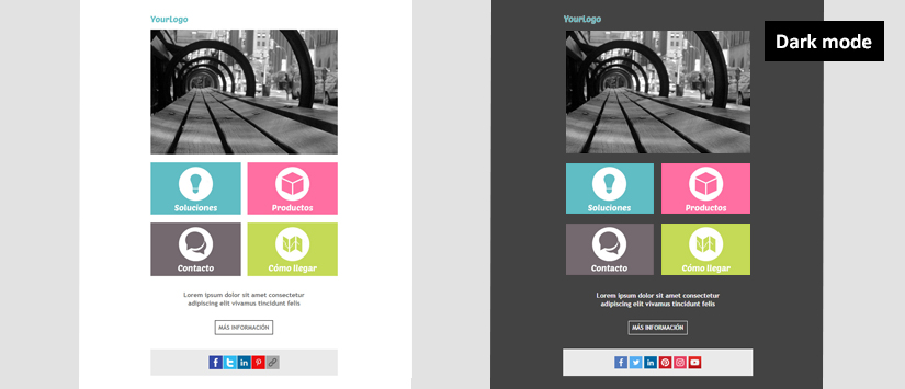
In our templates, you will find several monochromatic colour palettes, based on a single colour used for backgrounds, highlights, titles, and buttons. "Travel," "Green," and "Pink" are ideal for those who want to stay true to their corporate color and make a clear impression on subscribers.
Halloween, Christmas, and Valentine's Day are occasions when you can temporarily set aside your corporate colours and adopt those that represent these holidays to infuse your campaigns with their spirit (orange, blue, red, etc.).

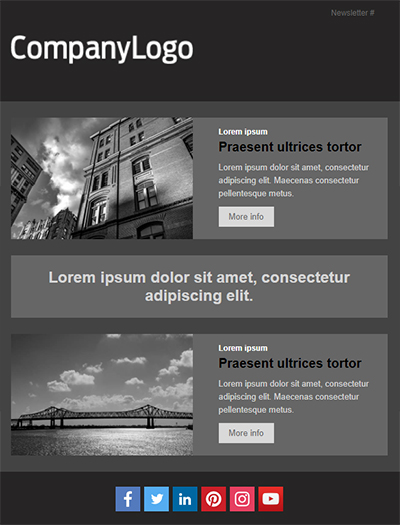
Finally, our templates "Grayscale," "Gray Shadows," and "Grey-black" are achromatic, or in other words, they are based on black and white or grayscale. This gives them an elegant look because the newsletter appears cleaner, eliminating distractions and allowing the smoother reading. In this case, the colour of the accompanying images is as important as the elements we've discussed (buttons, highlights, titles).
To help you find the right colour combination for your campaigns, you can use online tools like Coolors or Colourco. These free tools are colour palette generators that can inspire you to step out of your comfort zone and develop your brand's chromatic personality. Give them a try and have fun finding the perfect colours for your newsletters.
Do not miss anything from our blog and join our Telegram https://t.me/acrelianews
Haven't you tried Acrelia News yet?
If you like this post, you will like much more our email marketing tool: professional, easy to use.

Sign up to our newsletter
Last email marketing trends and news


 Tips and tricksE-BooksTrends and newsCase studiesInfographics

© Copyright 2024 Acrelia News | Terms of use | Cookies Policy | Legal notice | Privacy Policy